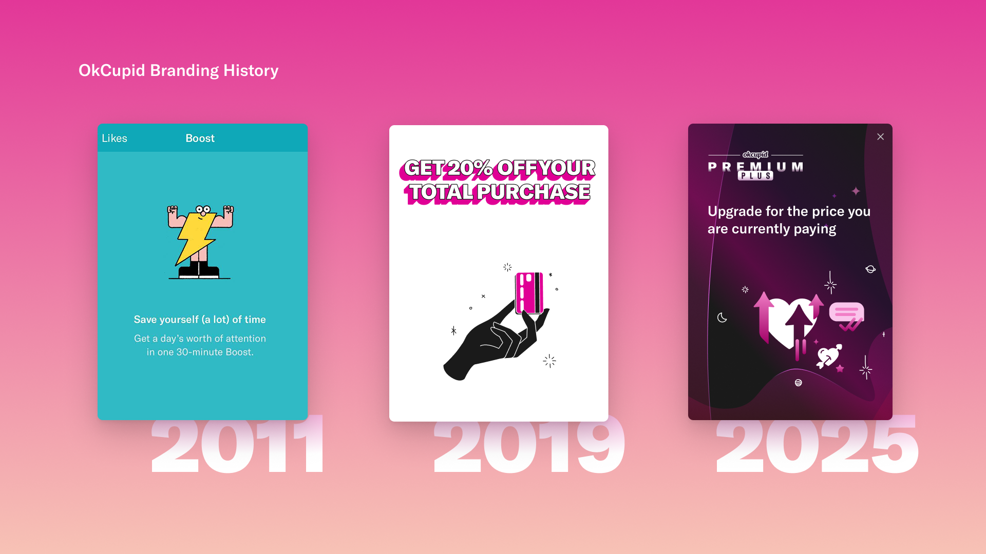
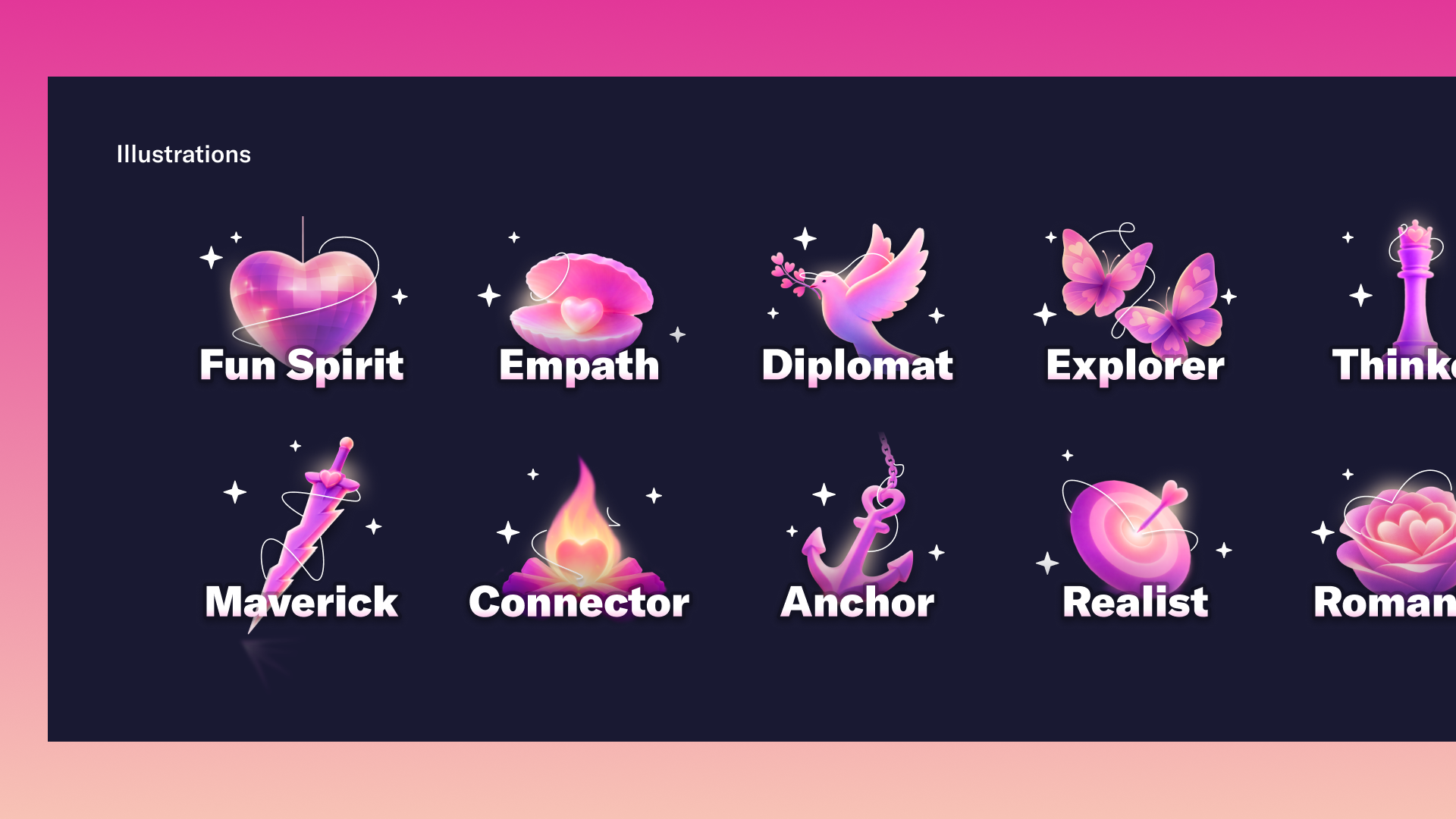
Rebranding with AI
As OkCupid pivots toward a compatibility-based matching experience to engage a new generation of users, its brand and product needed to evolve in tandem. With no major visual update in over six years and an interface that felt increasingly outdated, this effort reimagines OkCupid's look and feel through a more modern lens, incorporating emerging UI trends such as liquid glass. The rebrand was developed in-house, preserving core brand elements like its signature color palette while refreshing the overall system for a more contemporary and expressive identity. AI-powered tools were leveraged to generate new illustration assets, enabling rapid exploration and definition of a cohesive, updated visual language.

Approach
- Audit & Align: Evaluated existing brand, product UI, and market trends to identify gaps and opportunities tied to the compatibility-based positioning.
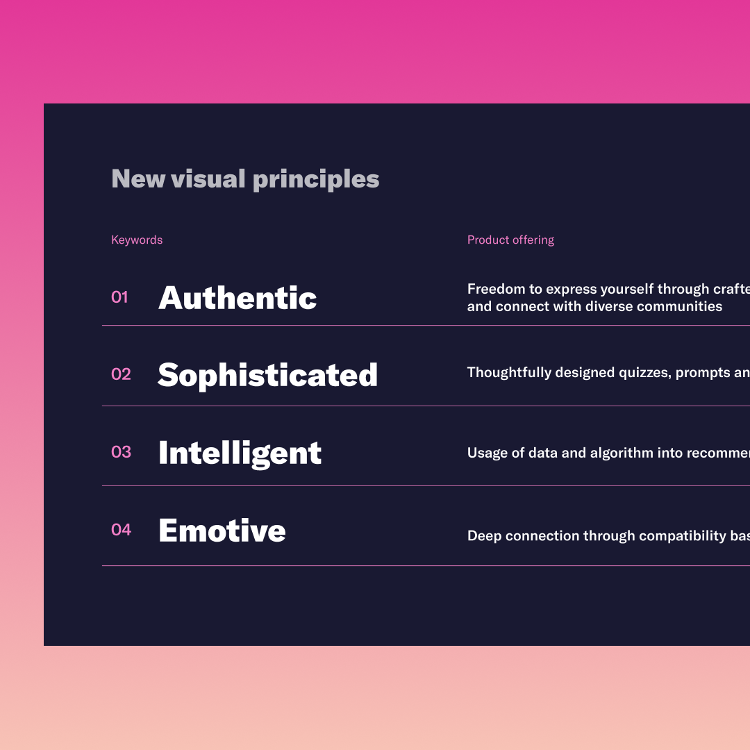
- Define Visual Direction: Explored modern design patterns (e.g., liquid glass) while preserving core brand elements like color and tone.
- Leverage AI for Exploration: Used AI tools to rapidly generate and iterate on illustration styles and visual assets.
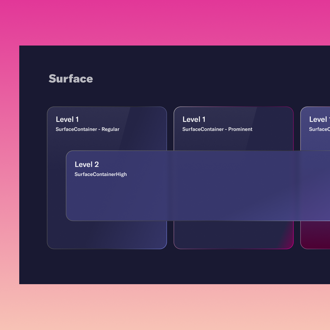
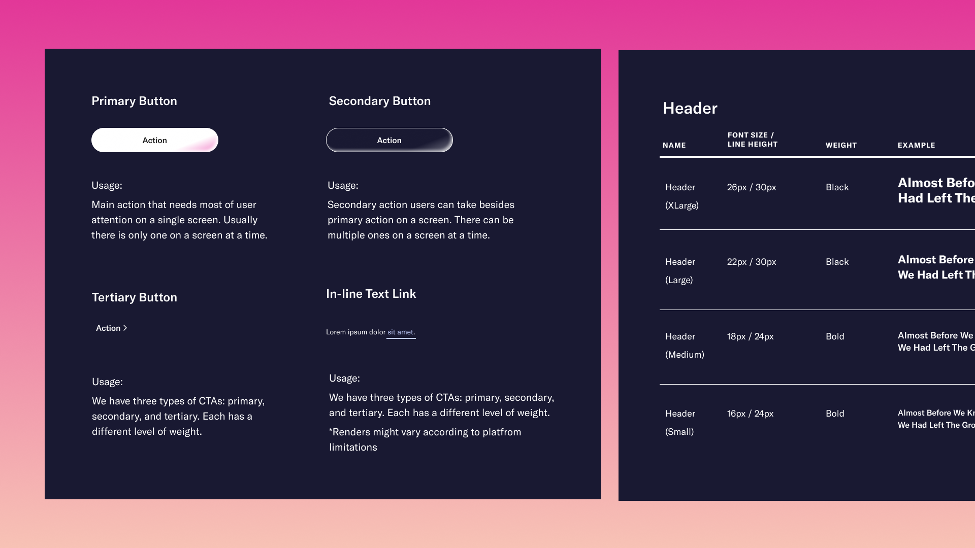
- Design System Integration: Translated the new visual language into scalable components and patterns for product use.
- Iterate with Feedback: Collaborated with cross-functional stakeholders to refine direction and ensure alignment.
- Prepare for Rollout: Delivered assets and guidelines to support consistent implementation across the product.
Goal
The goal of this project was to modernize OkCupid's brand and product experience to better resonate with a younger, intent-driven audience. This included aligning the visual identity with the shift toward compatibility-based matching, refreshing the interface with contemporary design patterns, and creating a more engaging, cohesive look and feel. At the same time, the work aimed to preserve the essence of the OkCupid brand while enabling faster, scalable asset creation through the use of AI-driven tools.
Impact
In development
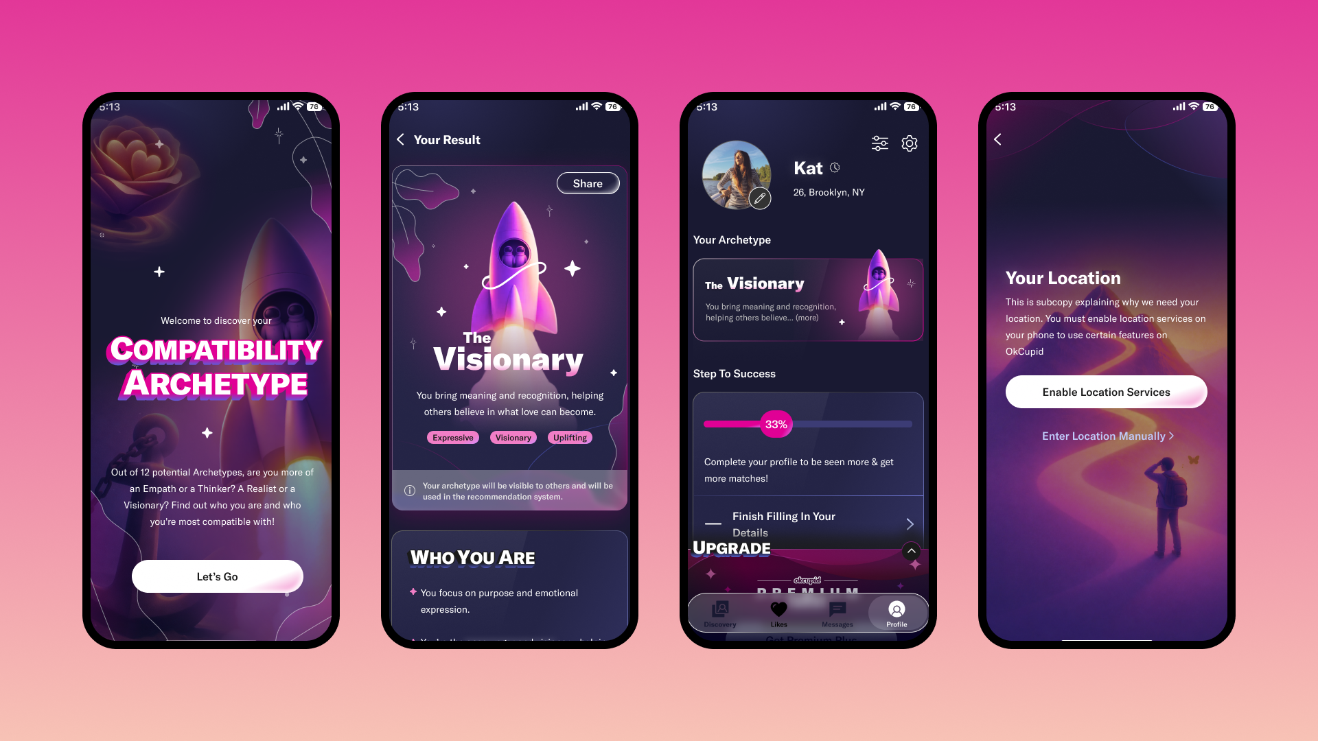
Product Snapshots